Chinese Arts&Crafts, Hong Kong

Location: Hong Kong
Client: Chinese Arts & Crafts (HK) Ltd.
Area: 230 sqm
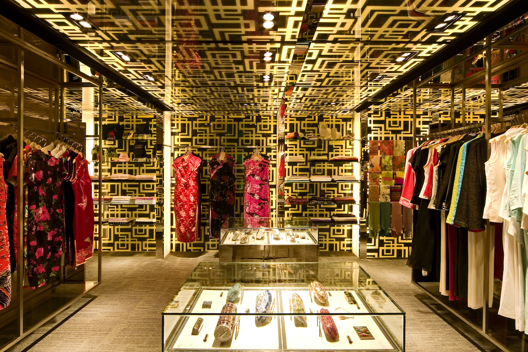
Chinese Arts & Crafts – JD Mall Store is the newest store recently launched by China Resources Retail (Group) Co., Ltd. in Hong Kong. It is a re-branding exercise to offer a distilled range of men's & ladies' apparels, antiques and a collection of novelty jewellery items - all of which had enhanced the concept of revitalizing Chinese arts.
The interior design strategy adopted was to re-interpret the brand identity by re-visiting the potential Chinese aesthetic elements in a contemporary way.
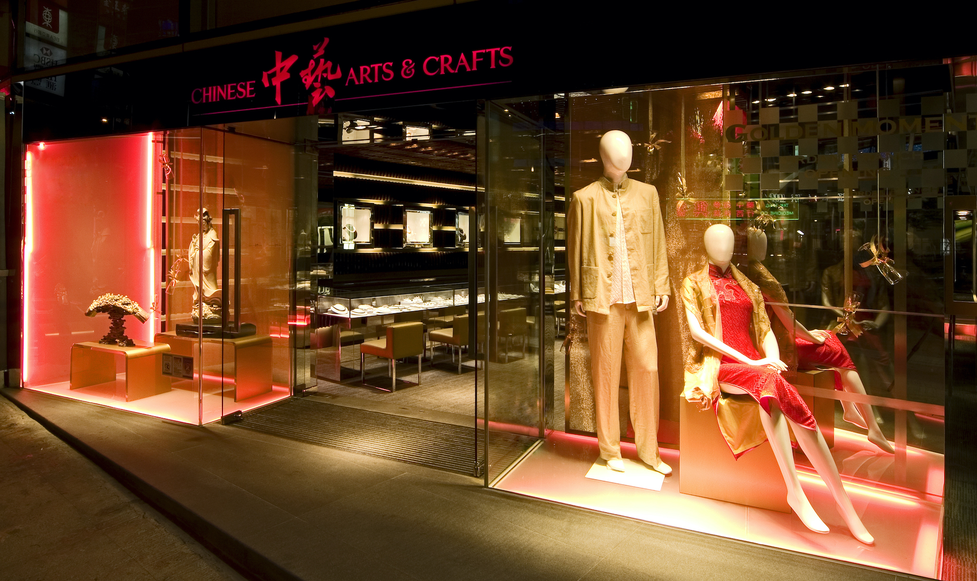
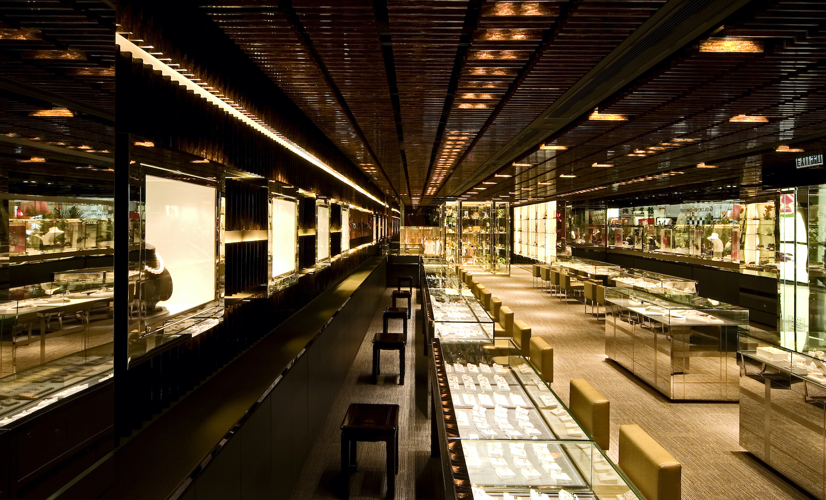
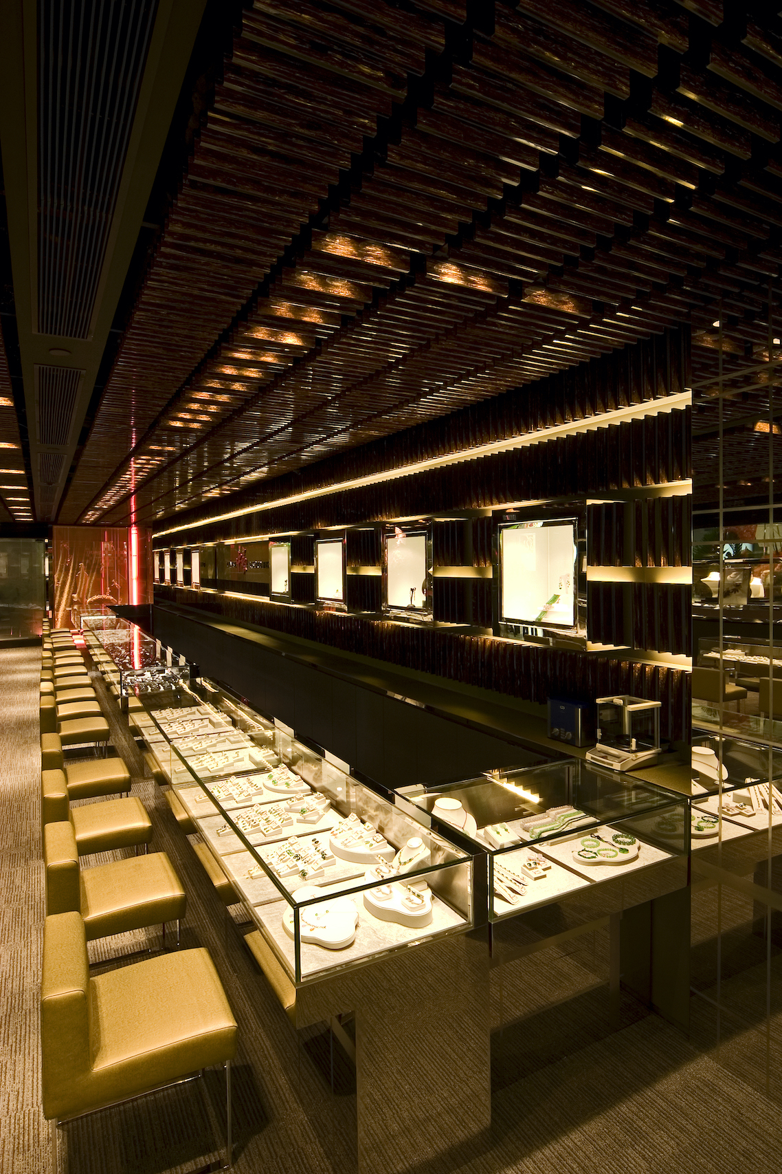
To achieve this, the interior design made use of the metaphor of interpreting the shopping space as a “Chinese Gift Box” to contain different types of prestigious gifts inside.
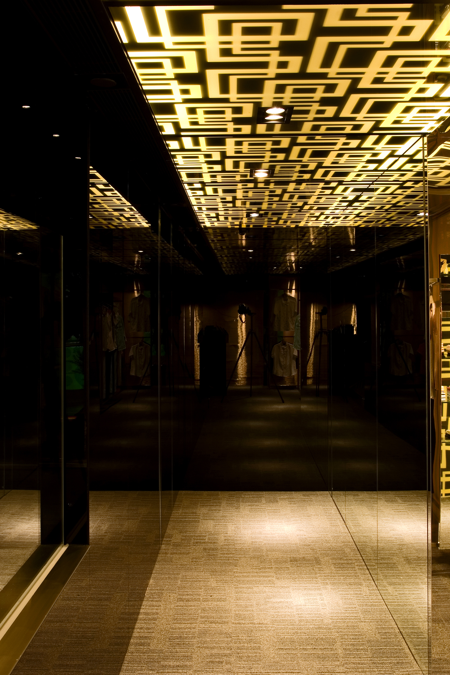
Dark spatial envelope of charcoal grey carpet floor and exposed ceiling are firstly set up to provide an understated backdrop to the space. This was followed by combining the rectilinear composition of grids in both 2D & 3D ways.
To echo the narrow and long spatial characters of the site, rectilinear arrangements of the 3 key zones’ display and light systems were adopted. The “Chineseness” of this retail space was aimed to be executed in both aesthetic and functional layers:
1st compartment - Jewellery Zone:
Feature wall-cum-ceiling of golden marble-patterned plastic fins created the texture of the “1st compartment” within the big gift box. Rows of golden yellow concealed light troughs reinforced the horizontality of this zone and linked up the 1st & 2nd compartment in a subtle way. Adjustable down spot lights created highlights to the delicate jewellery (diamond & jade) items with the help of the dim environment.
Floating window display showcases with moving red LED lighting gave a glamorous / chic touch and symbolized an inter-weaving “red ribbon” in wrapping a gift box.
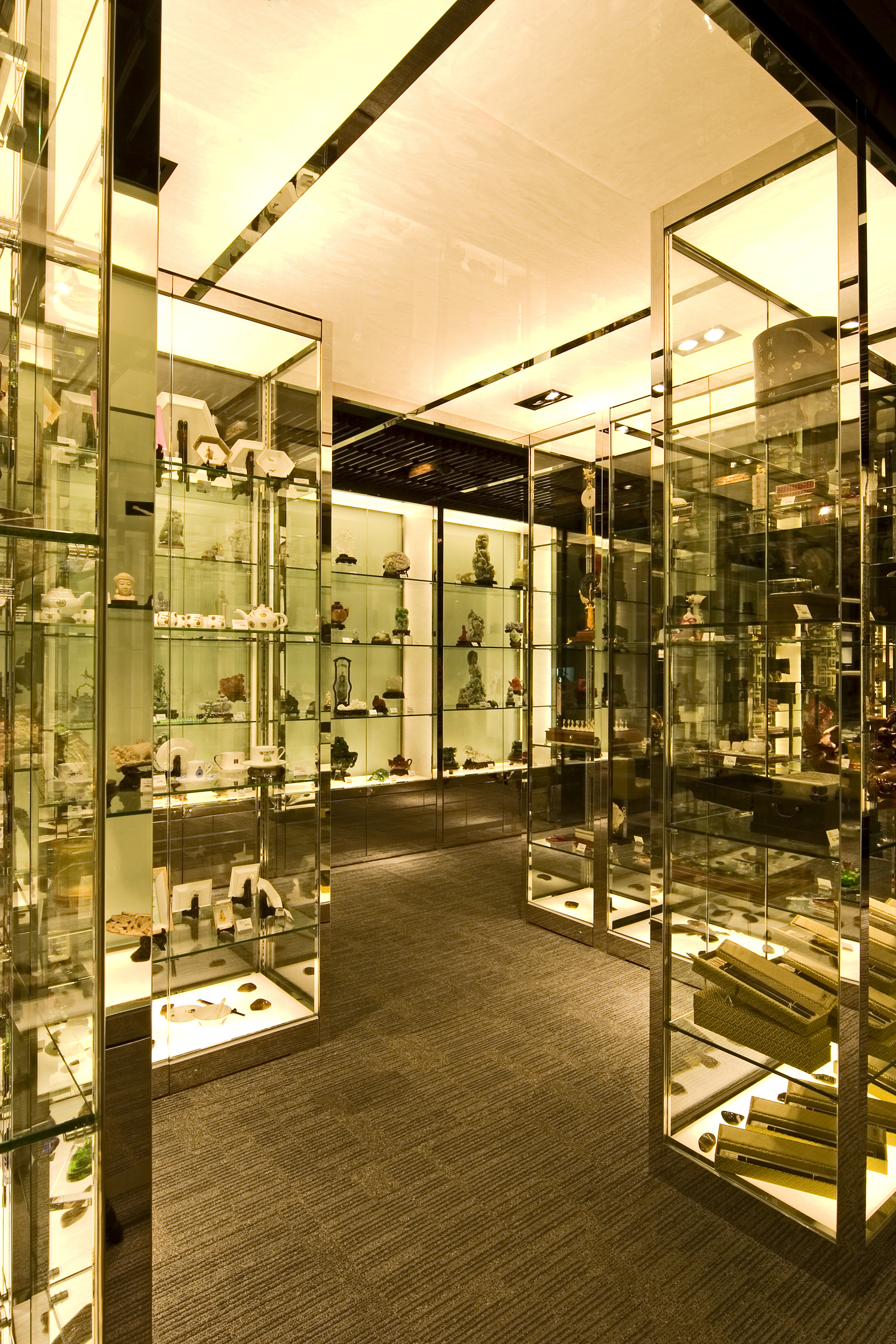
2nd compartment - Antique Zone:
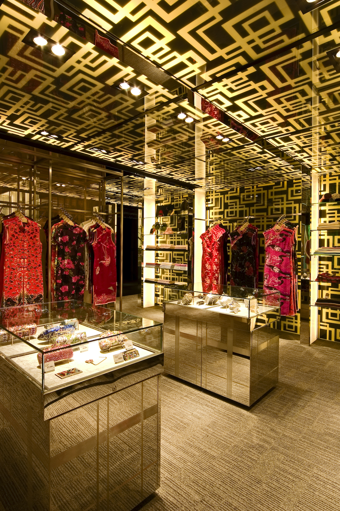
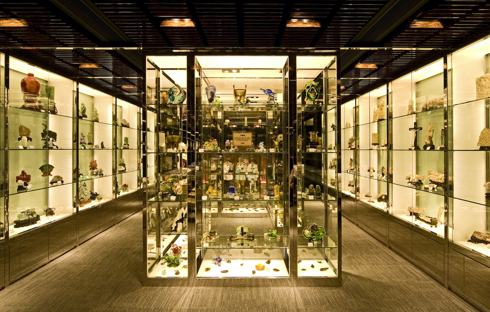
Grid display language results from the overlapping of the horizontality & verticality of the 1st & 3rd compartments respectively; they became horizontal glazed shelves and glowing vertical dividers of the wall units.
Central full height glazed “pavilion” display showcases became focus of the zone and provide opportunity for customers to look at the antique products in a 3-dimensional way.
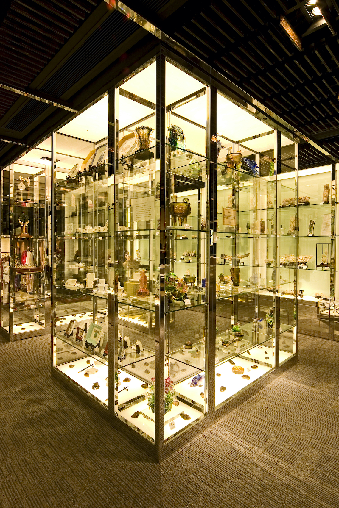
3rd compartment - Apparel Zone:
The interplay of grid elements is finally completed with the glowing “wrapping paper” walls & ceiling. Custom made translucent monogram patterned glass diffused golden ambient light to reinforce the nostalgic mood.
System of free-standing / ceiling-suspended stainless steel hanger frameworks expressed the verticality and played the role of spatial dividers which penetrated into the apparel zone and floated the merchandise to the eyes of the customers.
